Writing report
academic IELTS Writing: Task 1
Overall score
6.00
6.0 of 9.0
Submitted on
Dec 06, 2024 (over 1 year ago)
Writing duration
0 minutes
Task description
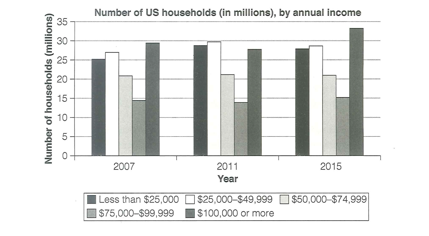
The chart below shows the number of households in the US by their annual income in 2007, 2011 and 2015. Summarize the information by selecting and reporting the main features, and make comparisons where relevant.
You should write a minimum of 150 words.

Source: Cambridge 18
Task answer
The presented graph shows the number of family in USA by their yearly earning in 2007, 2011, 2015. Units are measured in millions.
It can be clearly seen that the income from $100,000 or more had the highest amount of family, whereas $75000-$99,999 showed lowest quantity throughout the period.
As is presented in the column, in year 2007 highest quota of household was in range of $100,000 or more while it was lowest in $75,000-$99,999 reaching 29 millions from 13 millons respectively. Remaning income level displayed slight fluctuations, starting at 25 millions in less than $25,000, peaking at 27 millions in $25,000-$49,999 and droping to 20 millions in $75,000- $99,999.
On the other hand, $25,000-$49,999 saw moderate growth, climbing from 27 millions to 30 millions in 2011 compared to 2007. While, the height of $75,000-$99,999 seems to remain unchanged in 2011 through the overview of 2007. In addition, yield group of $100,000 or more reached a peak in 2015 ; just above 34 millions in contrast to the year 2007 and 2011. Moreover, the figure of houses at $75,000-$99,999 had tediously soar to 15 millions by 2015.
Word count:184