Writing report
academic IELTS Writing: Task 1
Overall score
6.00
6.0 of 9.0
Submitted on
Dec 19, 2024 (over 1 year ago)
Writing duration
0 minutes
Task description
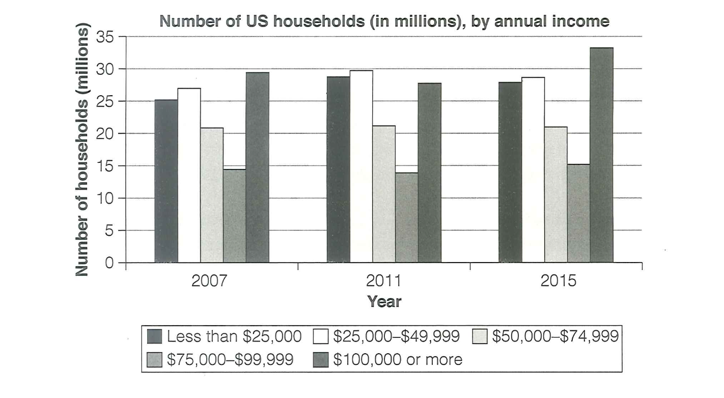
The chart below shows the number of households in the US by their annual income in 2007, 2011 and 2015. Summarize the information by selecting and reporting the main features, and make comparisons where relevant.
You should write a minimum of 150 words.

Source: Cambridge 18
Task answer
The bar graph depicts the amount of US families with respect to their yearly earnings in 2007,2011 and 2015 respectively.
It is evident from the chart that the number of higher class housholds increases steadily through out the given years of span. Similarly, a similar trend is followed by the lower class and lower middle class dwellings: however, showing a slight fluctuation. On ther other hand, the middle class and higher middle class housings maintains a same proportion from 2007 till 2015.
In the first 4 years interval from 2007 to 2011 there is a slight decline in the number of families having a per capita income of $100,000 or more but rises up in the next interval till 2015. Moreover, the households having an early income of less than $25,000 and that of $25,000-$49,999 illustrates a falling trend after attaining a peak in 2011.
For the dwellings having an annual earnings between $50,000-$74,999 and $75,000-$99,999 respectively represents a constant number in each four year period. These trends clearly reflects that the upper family class are becoming wealthier by time
Word count:177