Writing report
academic IELTS Writing: Task 1
Overall score
6.00
6.0 of 9.0
Submitted on
Mar 02, 2025 (over 1 year ago)
Writing duration
0 minutes
Task description
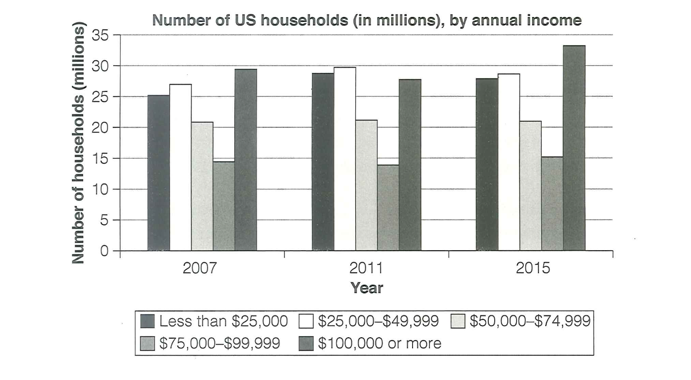
The chart below shows the number of households in the US by their annual income in 2007, 2011 and 2015. Summarize the information by selecting and reporting the main features, and make comparisons where relevant.
You should write a minimum of 150 words.
Source: Cambridge 18
Task answer
The chart above illustrates the amount of households in the US based on their yearly income in a period of time from 2007 to 2011 and 2015 respectively.
It is observational that most homeowners in the States made $100,000 or more anually in 2007 and 2015, while in 2011, the amount of landlords who made less than $25,000 a year was significantly high. The rest three categories had fluctuations throughout the three years but it was not relevant.
In 2007, almost 30 millions households had $100,000 income, making it the most dominant category. Whereas the amount of households who made $75,000-$90,000 was just below 15 millions, which was as half as the highest income group in 2007, making it the lowest proportion. The figure for landlords who made less than $75,000 in 2007 ranged from 20 to 25 millions.
In 2011, the number of households who made more than a grand slightly dropped, but then dramatically increased to over 35 millions in 2015. The figure for homeowners who made $25,000-$49,000 had a sharp rose to 30 millions, making it the most popular trend this year, while for landlords who made $50,000-$74,999, the number stably stayed at just a little over 20 millions
Word count:200