Writing report
academic IELTS Writing: Task 1
Overall score
8.00
8.0 of 9.0
Submitted on
Mar 14, 2025 (over 1 year ago)
Writing duration
0 minutes
Task description
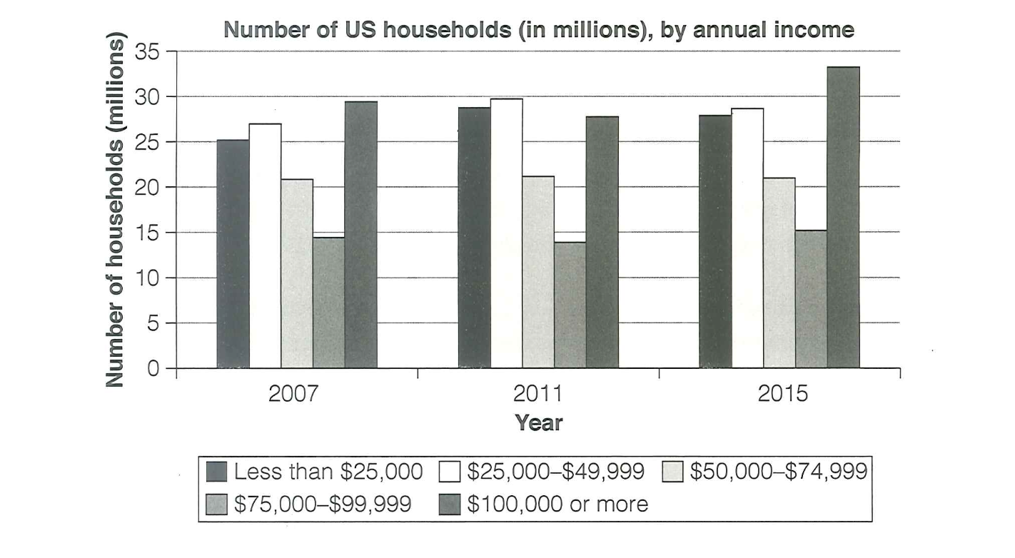
The chart below shows the number of households in the US by their annual income in 2007, 2011 and 2015. Summarize the information by selecting and reporting the main features, and make comparisons where relevant.
You should write a minimum of 150 words.
Source: Cambridge 18
Task answer
The bar chart illustrates the number of households in the US categorize by their yearly earnings in 2007, 2011, and 2015.
Overall, there was a noticeable increase in the number of households earning $100,000 or more, whereas lower-income groups saw either a decline or remained relatively stable. The middle-income groups experienced minor fluctuations.
In 2007, the $100,000+ income group had closely 30 million households, making it the largest category. This figure increased steadily over the years, reaching nearly 34 million in 2015. Conversely, the lowest income group (under $25,000) started at approximately 26 million but declined slightly in subsequent years.
The middle-income categories ($25,000 - $49,999, $50,000 - $74,999, and $75,000 - $99,999) exhibited mixed trends. The $50,000–$74,999 group remained stable, while the $75,000–$99,999 group showed a gradual increase. Meanwhile, the $25,000–$49,999 bracket slightly decreased over time. In conclusion, the data suggests that higher-income households became more prevalent between 2007 and 2015, while lower-income groups saw a gradual decline, reflecting potential economic growth.
Word count:160