Writing report
academic IELTS Writing: Task 1
Overall score
6.50
6.5 of 9.0
Submitted on
Mar 19, 2025 (over 1 year ago)
Writing duration
0 minutes
Task description
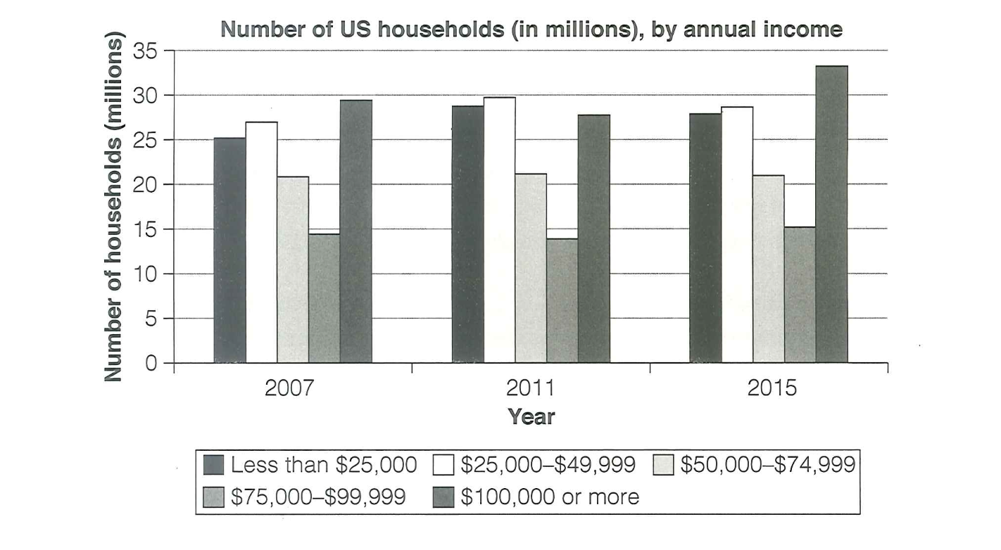
The chart below shows the number of households in the US by their annual income in 2007, 2011 and 2015. Summarize the information by selecting and reporting the main features, and make comparisons where relevant.
You should write a minimum of 150 words.
Source: Cambridge 18
Task answer
The given chart conveys the relationship between the number of households in the US by their incomes earned per year in given years: 2007,2011 and 2015. Incomes vary in different categories from earning less than $25,000 to more than $100,000 annually.
The number of US households of annual income of $100,000 or more has been more superior among the three years excluding 2011 where the number of US households earning $100,000 per year comes in third place. However, the number of households earning $75,000-$99,999 per year has subsequently been the lowest across the three years with an average of 15 million households.
Furthermore, in 2017, 25 million US households earned less than $25,000 annually, approximately, 27 million US households earned $25,000-$49,999, 20 million earned $50,000-$74,999, 15 million earned $75,000-$99,999 and the highest number of US households earned $100,000 or more with approximately 30 million households.
Significant changes can be seen from the year 2011 to 2015 as the highest number of households changed from those earning $25,000-$49,999 to $100,000 or more annually. In contrast, households earning lower than $100,000 did not experience any significant change between the two years.
Word count:186