Writing report
academic IELTS Writing: Task 1
Overall score
8.00
8.0 of 9.0
Submitted on
May 27, 2025 (about 1 year ago)
Writing duration
0 minutes
Task description
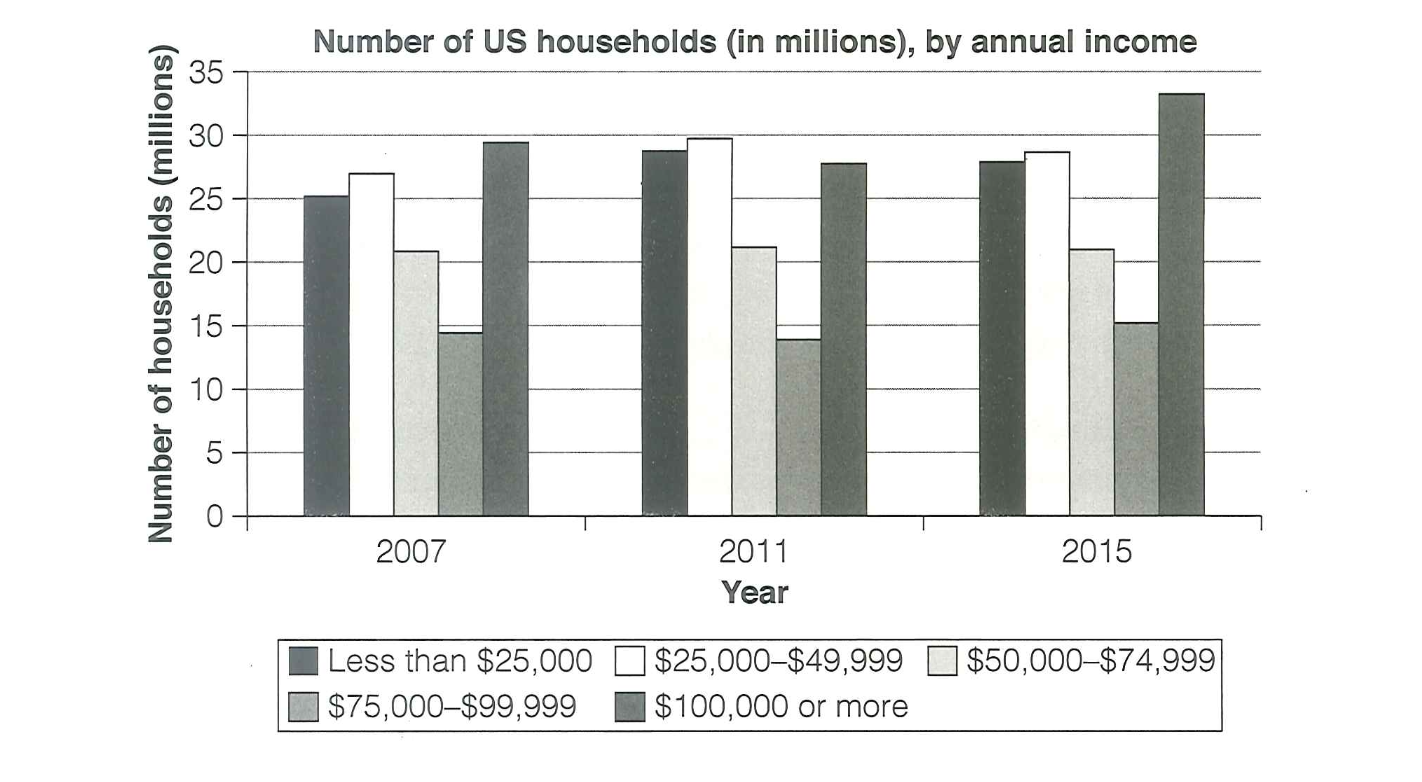
The chart below shows the number of households in the US by their annual income in 2007, 2011 and 2015. Summarize the information by selecting and reporting the main features, and make comparisons where relevant.
You should write a minimum of 150 words.
Source: Cambridge 18
Task answer
The bar chart illustrates the number of households in the United States across six different income brackets in the years 2007, 2011, and 2015.
Overall, there was a notable rise in the number of high-income households earning $100,000 or more over the given period, while households earning less than $25,000 also remained consistently high. Mid-range income groups saw relatively smaller changes.
In 2007, the most common income category was $100,000 or more, with around 27 million households, followed closely by the lowest income group (less than $25,000), which accounted for roughly 26 million. Households in the middle income brackets ranged from about 17 to 24 million.
By 2011, there was a slight dip in most income categories due to the economic downturn, yet households earning over $100,000 remained stable at around 29 million. The number of those in the lowest income group rose slightly, exceeding all others except the top bracket. In 2015, the number of high-income households surged to approximately 33 million, significantly outpacing all other groups. Meanwhile, the number of households earning less than $25,000 remained just under 30 million. Other income categories saw moderate increases, but none as dramatic as the highest bracket.
Word count:193