Writing report
academic IELTS Writing: Task 1
Overall score
7.50
7.5 of 9.0
Submitted on
May 31, 2025 (about 1 year ago)
Writing duration
0 minutes
Task description
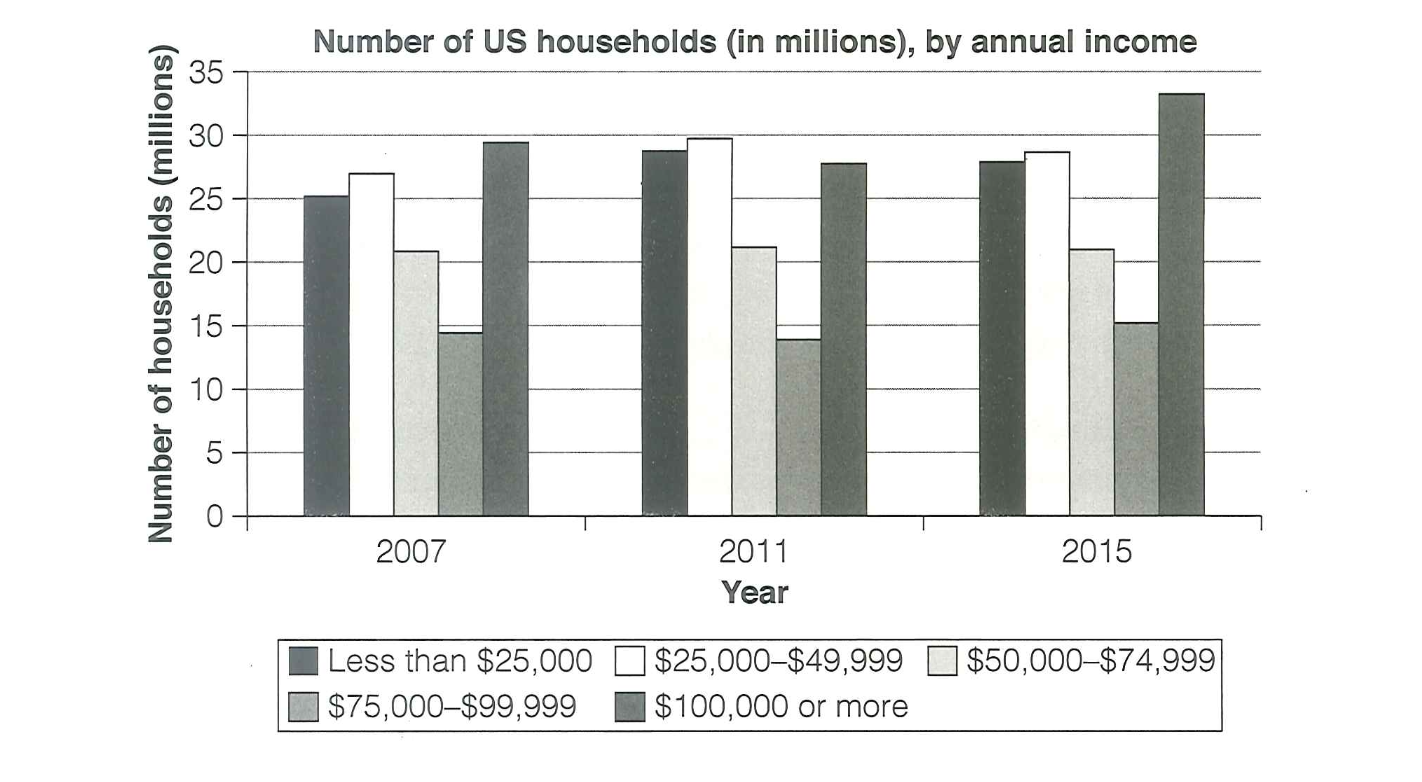
The chart below shows the number of households in the US by their annual income in 2007, 2011 and 2015. Summarize the information by selecting and reporting the main features, and make comparisons where relevant.
You should write a minimum of 150 words.
Source: Cambridge 18
Task answer
The bar graph categorizes US families in five brackets based on their earnings in 2007, 2011 and 2015.
Overall, the graphs of less than $25000 and $25000-$49000 groups peaked in 2011, while that of $100000 or more group witnessed a dip in that year. Additionally, the number of families earning from $50000 to $99999 remained nearly unchanged throughout the period.
Regarding the less than $25000 and $25000-$49000 categories which witnessed the same trend, in 2007, 25 millions households earned less than $25000 annually. That number then rose to about 29 millions in 2011, before declined back to approximately 28 millions in 2015. Similarly, the number of families having annual income in the range $25000-$49999 was roughly 27 millions in 2007, then peaked at 30 millions in 2011, becoming the highest number in that year. Eventually, about 29 millions households were in that groups at the end of the period.
Considering $100000 or more category with the reversed trend, in 2007, this is the most popular group with nearly 30 millions families. After that, that number reached the low of roughly 28 millions in 2011, before rocketed to nearly 35 millions in 2015, which is the highest number of the chart. On the other hand, there was no significant change in $50000-$74999 and $75000-$99999 categories. These two groups remained as the two least popular with the respective number of households were above 20 millions and approximately 15 millions.
Word count:234