Writing report
academic IELTS Writing: Task 1
Overall score
7.50
7.5 of 9.0
Submitted on
Aug 08, 2025 (11 months ago)
Writing duration
0 minutes
Task description
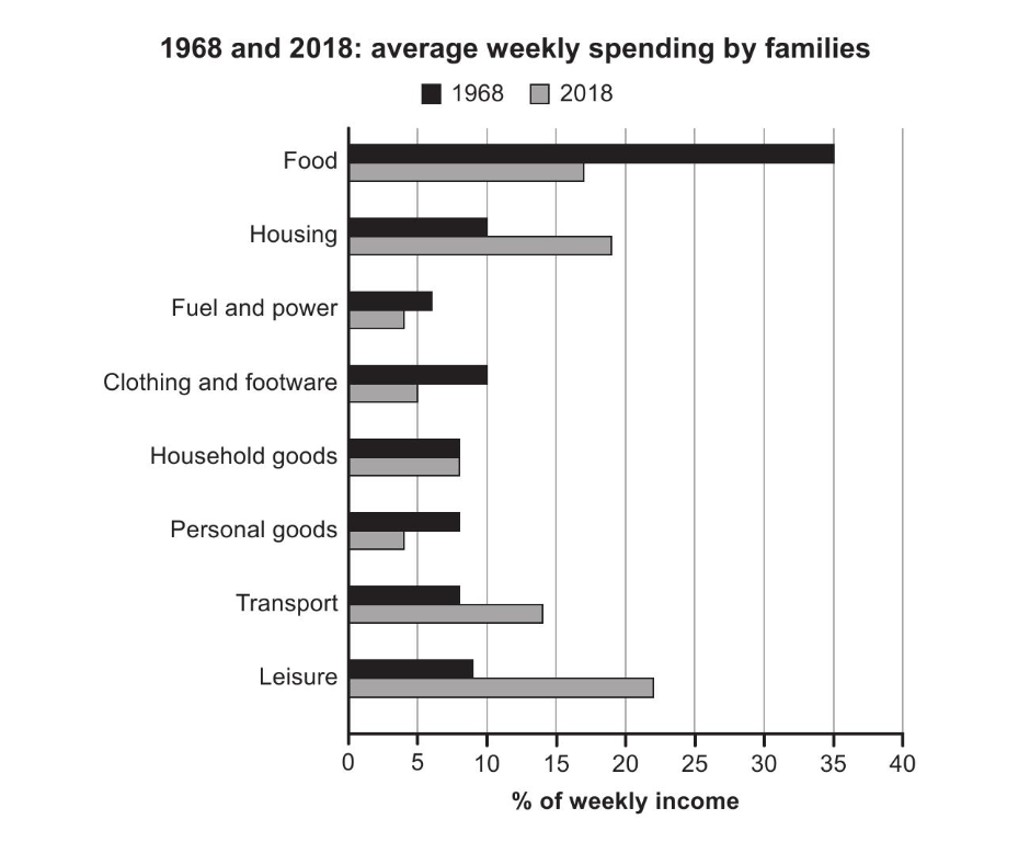
The chart below gives information about how families in one country spent their weekly income in 1968 and in 2018. Summarize the information by selecting and reporting the main features, and make comparisons where relevant.
You should write a minimum of 150 words.
Source: Cambridge 17
Task answer
The bar chart provides data on the weekly revenue spendings of households in a specific country in 1968 and in 2018.
Overall, while the families in 1968 spent most of their salary on food, the ones in 2018 allocated their revenue mostly for leisure, showcasing how spending priorities evolved in fifty years.
In 1968, the families used the majority of their wages to meet their fundamental needs, such as food, housing, clothing, and footware. The rates for these categories are 35%, 10%, and 10%, making up more than half of their total income. What they spent the least money on is fuel and power, rating just below 5%. The remaining categories hover between 7% and 10%.
On the contrary, in 2018, the households shifted their priorities and started spending nearly 20% less money on food, utilizing more budget for leisure and housing, which stood at around 22% and 19%, respectively. They allocated the least amount of money for personal goods and fuel and power, both of which are positioned slightly below 5%, depicting a similar pattern to that of 1968.
Word count:177